In this project, we are required to produce an experimental outcome involving digital media which is designed to participate in or support a major public exhibition. The project title is "Sensation: Artifice + Desire" and it was group project. My group members consist of: Chan Si Khei, Debbie Cheah, Cheng Chor Yi and Foo Chun Khong.
Our 1st Meeting-6 Jan 2011
We start our meeting with job delegation. Leader: Debbie Cheah Documentation/Producer: *Me* Graphic: Chan Si Khei, *Me*, Cheng Chor Yi Programming: Foo Chun Khong Editor : Cheng Chor Yi After that, we start brainstorming for idea and concept. In this project, we are encouraged to try on the multi-touch technology as the interaction for this exhibition. However, we were shocking when we received the price list for the equipment that needed for doing this high-tech interaction. It cost RM300++ each member in order to buy those equipment. So, we decided to think of an idea which involve other low cost interact technology like motion detect and so on. Here we start..... After some time of chit-chat among group member, we have come out with several ideas that may link with the theme of "Sensation", which included the traditional Chinese wedding, traditional games and cerita dongeng of Malaysian. We have decided to use traditional games as our theme for this project as it seem to have higher interactivity level than the other two. Besides that, there are a lot of case studies that allow us to refer. This idea is to create a installation device to teach future generation on how to play the traditional games as these tradition have been slowly vanished overtime.
Idea BaNnEd-10 Jan 2011
Ohh...we found out that our idea couldn't work after the first consultation with lecturer. We asked to read again the brief for better understanding of the project theme as our initial idea couldn't meet the requirement of the title. What is "sensation", what is "artifice" and what is "desire"??? This was the question we stuck at when asked by lecturer. So..........the result is..............RETHINK FOR IDEA. We need to research on the definition of these THREE words for better understanding.
Brainstorming Again-14 Jan 2011
Think..think..think...."how about SEX?"...a magical word that comes out from someone's mouth which enlightens everyone from struggling for idea. Haha..this magical words brings excitement to everyone throughout the meeting. Finally we get a theme to work on which it seem to successfully meet the requirement of "Sensation, Artifice & Desire". We start discussion and research for this idea. At the same time, we have also come out with some initial sketches. This idea is to bring out prostitution issue to the public especially to the future generation as sexual have become a common things to the youngest today. It believes that the sexual desire of youngest will become wider in the future. So in this project we wish to use reverse psychology to convey our message. We have sketched out some device designs for this idea. The design is a toilet look machine where there will be a female body part hidden beneath. Everyone was ok with the theme and idea. Yes!!(hope that lecturer will ok with it too..)
The ThEmE is there!- 17 Jan 2011
Yes!!!Jazmi said that our theme is there but there is still lack of content and the impact of the message is low. He suggested us to explore more on prostitution and sexual desire. Besides that, he asked us to think of the rewards that users may get after interact with the installation. There are also some useful suggestions given by him which may help us to further improve our idea.
Further Development & Proposal-20 Jan 2011
We require to do a poster which display our ideas and present it on next week. So, me and Chun Khong were typing the proposal while waiting for others member to meet up at the base room. After they come, we started our discussion again to further development our idea. We discussed about the research that we get and try to amend on the design of the device itself so that it may bring some impact out. We decided to change our device into a vending machine that sell sex service after inspired by a reference images that showed by Chor Yi which is a Japanese buying a girl from a vending machine. It is ideally for us where it could stimulate the purchasing experiences for users.(prostitute-in the real world, we pay for service^^). Besides that, it could also enhance users' experiences through the interaction.
p/s:me & Chun Khong work together to do the poster as i will do the layout while he will add in the contents)
1st version of poster


ReDo?!??- 24 Jan 2011
Today is the poster presentation day. I was absent due to some personal issue but i receive a GOSH NEWS from my group member...You know what?? We need to REDO for our poster!!!and the reason is our poster look different than other groups. The contents of the poster are there however we need to reorganize the structure for readability. Haiz...luckily we are not required to retype the whole content.*I will faint down*..haha..Debbie said she will help us to restructure the poster as well as the proposal..^^
ConSulTation-11 Feb 2011
We have consultation with lecturer today.We showed them our proposal(after amendment). Besides that, we also showed them our installation mechanism and they suggested us some material to use for building the vending machine. At the same time, we also showed them our trailer which is still in progress and they asked us to change the typography for better readability. Besides that, give some hint of our project idea in the trailer like graphic or music to trigger user's curiosity.
Alpha Testing-14 Feb 2011
In the alpha testing, we demonstrate the programming without any graphics as we plannings to do video shooting for the graphic part on coming Thursday(17 Feb 2011). We took down the measurement at the same day as well.
Start Producing Machine-18 Feb 2011
I was worry all day long for the machine material and we have 3 days left to the Beta Testing. We haven't done anything for the machine device and even the material needed for the machine was unknown. Finally.......We decided to use polystyrene as the material for the machine because it is the most easy material to get. We started to cut and paint the polystyrene boards according to the proposal design and measurement. It is not a smooth production as we found out that the polystyrene boards are difficult to cut by using art cutter. Besides that, one more things that we concern about was the stability of the boards for interacting during the installation as it is light weighted. Hope everything goes fine...
Start My JoB- 20 Feb 2011
I start creating the graphic for the vending machine option button part (*since Si Khei have done mechanism design for proposal,now is my time to help la^^*) TEAMWORK is important...hoho...4 characteristic icon design...Go..Go..Go....
Wild Girl

Girl Next Door

School Girl

Office Lady

Alpha-Beta Testing-21 Feb 2011
Today is alpha-beta testing day which mean everything should be almost done for the testing including programming and graphic as well. We reach iis early in the morning to continue our progress. Chun Khong and Chor Yi start working on the rack which will be used to put our computer set as well as be the back bone for the light weighted polystyrene vending machine. Me and Si Khei continue merging all the polystyrene boards together to form the vending machine. Si Khei is always a good helper and listener as she never said a word when we need her help. I feel glad to be her group member.*^^* Debbie was busy editing the video clip.(Her perfectionist characteristic could something slower her progression..hehe). After sometime of hard work, we finally finish all the things.(but we are the last group to settle down everything...*___*)The outcome of the video is not complete as two of the video was corrupted and member who in charge of this things do not have the roots file(OMG!!!He cut & paste everything without saving any copy..*faint*..Haha...)However, we was lucky as there a volunteer helping us to retake the video again*Thanks..thanks...*
After the testing...It's time for CoMmeNtsssss..There are several comments given by the lecturers like clearer instruction, lower the background sound, screen & buttons positioning(mean....we need to re-cut the lovely polystyrene*faint again*), more stable racks, positioning of meter bar, methods to triggers users to received rewards from the bottom screen, icons graphic no obvious and so on.....
p/s:we are quite happy with the testing even though it may looks unfinished however we could see our hard work on it...Never mind..do the refinement for better result..
Refinement Going On-24 Feb 2011
Restructure everything....Chun Khong start working on his dear racks whereas me, Si Khei and Debbie work on the vending machine structure. Cut..cut..cut..glue..glue..glue... However this time we do better in cutting the lovely polystyrene boards since we were cutting so many pieces from the beginning. More experiences in cutting and merging it..Good Job....
FiNish CoNstRuction- 25 Feb 2011
Finally we finish constructing everything. The "back bone" and the polystyrene machine become more stable now *happy*. Now, the only thing we need to do is replace the video clip. Hopefully everything can be done before the Beta testing.
Beta Testing-28 Feb 2011
We reached iis early in the morning to make sure that we could finish everything in time(*however we were still the last group to settle down everything*-_____-!!!).Wah...finally everything looks complete. The vending machine is stronger now. Yeah.....Again...time for comments...Even though there are still refinements needed for the coming installation however we was happy as we found that everyone is quite happy interacting with F.Me..(most importantly...we get a quite happy rating from shahnim...Yeah..) Refinement for coming installation:
Programming part:
- positioning of the meter bar---put higher
- colour of the meter bar---NO green
- change the "love" graphic in the meter bar--make it more energetic(orgasm reach)
- shorten the playing time
- Logo of F.Me is unclear
- Readability of typography
- instruction---change the graphic instruction to simple autopay machine methods(numbering)
- add graphic frame which could symbolic the characteristic of the girl
- differentiate the background colour to symbolize different characteristic
GrAphic Time-2 March 2011
Me and Si Khei work together to create the frames needed for the video clips. I will work on the vector part whereas Si Khei will work on photo montage part. Besides that, I also start my documentation for the group progress.


FiNalLy...-8 March 2011 Finally everything is done..Today is the final presentation for F.Me installation. Everything goes smoothly and the most important things are we able to finish everything in time ^^*wooHoo*We also get some comments from lecturer. The comments are:
- The impact sending is not strong and is to general. More research in order to get deeper understanding on the selected topic.
- The interactivity is good (user's experience) *happy*
- Improvement on presentation skill (is crowded during the presentation)
- Screening positioning
- The visual for instruction is not working
.....And the toughness time for us after the presentation is....DISMANTLE all the mechanism (our lovely polystyrene kiosk.... )

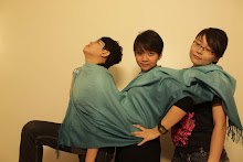
F.Me Installation and My Group Member